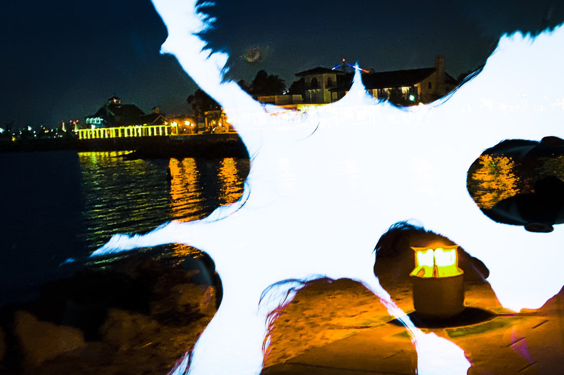
The photo on the left is amazing and I can see how it won. The double exposure is very well placed and very professional. This looks like it could be the front page of a magazine. My photo obviously looks very casual because it was simply done on a phone. The lighting of the winners photo is coming from the back which really adds to the photo and the mood of it. I'm still not completely sure what is being double exposed but it looks amazing. My photo still looks good but it as not as good quality as Emorey's. The juxtaposition of the double exposure is likely what made it win. The water in the photo really adds to it and the black and white filter makes everything pop. Overall great photo.
0 Comments
This photo is amazing because the lighting is done very well, the composition is perfect for the photo, there is amazing symmetry within the photo and it is just a very high quality photo. While my photo is more simplistic it is still good but not comparable to Henrick's photo. Both are well put together but Knudsen's photo is much better quality
I think that Kait's photo is much higher quality of mine and overshined my photo. Her photo was clearly taken on a professional camera which adds to the quality . The lighting is coming from the side which adds to the mystery feel of the photo. Overall her photo is so much better than mine and I see why she is famous.
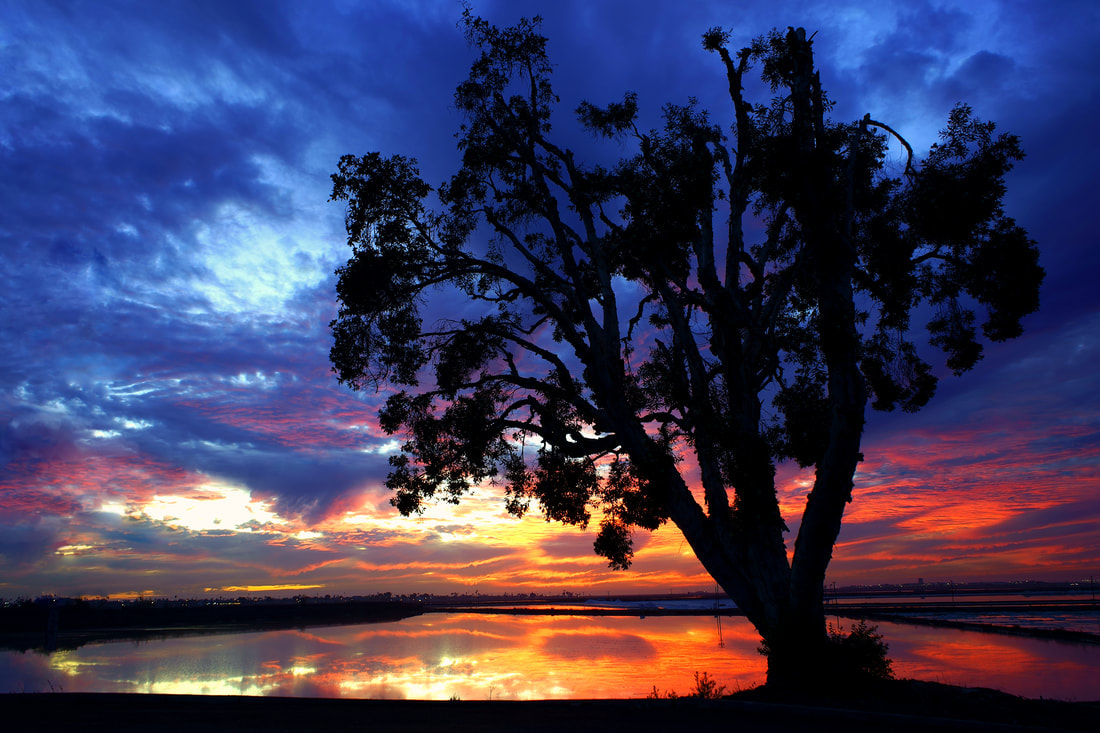
Both of these photos are very well put together and photographed but I think that Sophia's photo stands superior. The shadows on Sophia's photo are much better and add to the photo rather than in my photo the shadows of the tree take away from the photo. Both photos are beautiful regardless but hers over shines mine. The quality of the photo is also much better likely due to her access of a real camera compared to my cell phone camera. There is a lot of symmetry within Sophia's photo which also makes it better because mine is uneven. Both excellent works
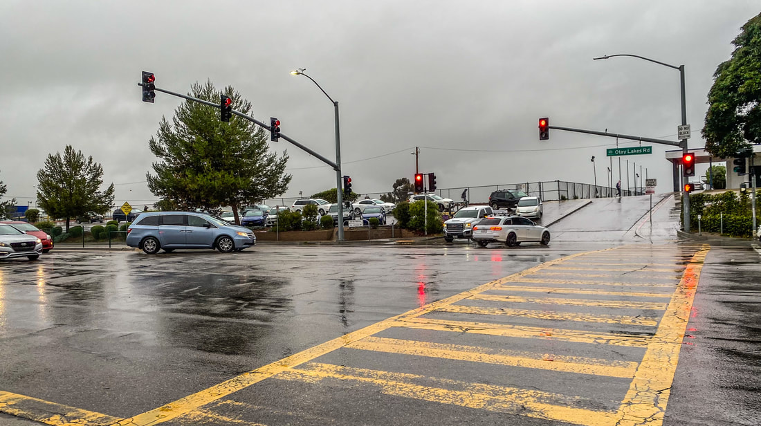
I think both of these photos are amazing because of the amount of color they portray and the contrast of shadows and lightness. The photo that won 1st place in the Nature category definitely deserved it partly because of the photo edit and pure good quality of the photo. The lighting on both are amazing but mine has more cityscape which makes theirs a better contender for the category.
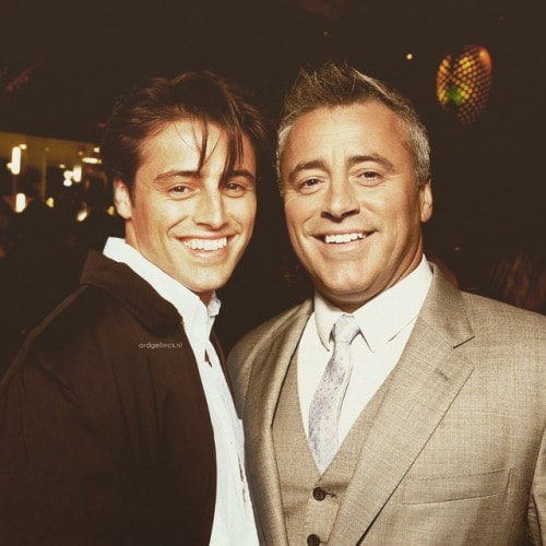
I think that the original is much better because mine is a collage and Ard's is actual photoshop. The photoshop is very good, it looks almost real and the lighting is paired really well to make it look more realistic. The composition makes them look like they're touching which is extremely intriguing. Ard's work is so amazing I'm glad he does what he does.
Xavier's photo is very well edited and shot. I think that the photo that won is better than mine because the quality is much better compared to mine. My concept seems much better but Xavier's photo still comes out on top. The lighting on the photo in San Francisco is very good and almost professional. the composition of the person is amazing which is why the photo likely won
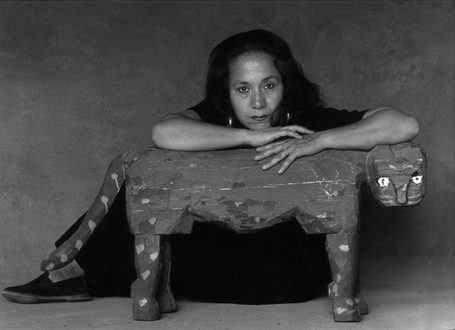
Richard Avedon's picture is so much better compared to mine. The photo is very fine art and amazing. The elephants in the background give shock value and spark curiosity among the viewer. The model in the foreground looks very beautiful and is very well dressed she is a good focal point. In my photo the model's are in a similar pose but I have two people, there is less of a shock value and mine is more documentary.
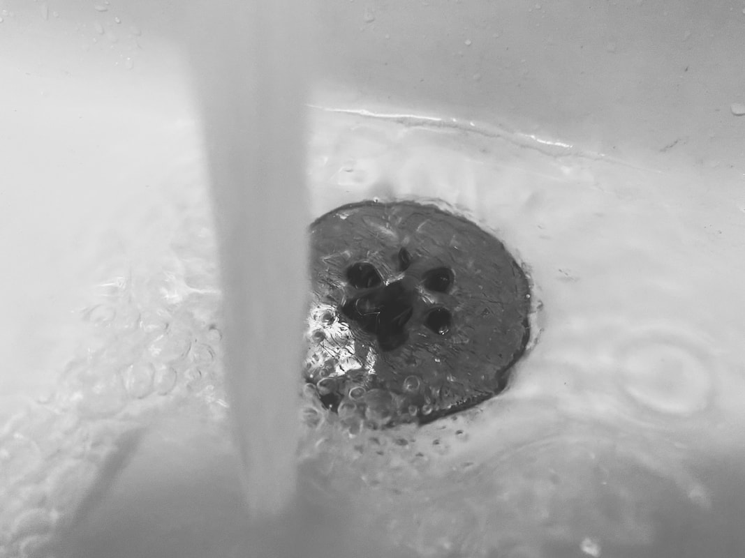
I think that the "Wash your hands" picture did deserve an honorable mention and was a very good picture but if it were against my picture I think mine would be a better contender because the water is more present in the photo. My max white is in the water and sink and my max black is in the sink while their max black is in their sweater and I think my concept is more creative. The lighting and quality of their photo is much better but with a better execution and better timing, mine could be very very good.
|