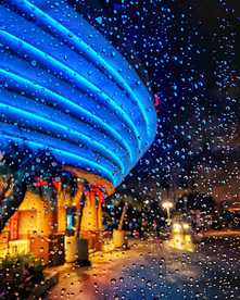
I think that Santiago's picture should win best of show because of how fine art it is. The composure of getting the theatre lights perfectly in the shot as well as the palm trees and rain drops, they all perfectly mesh together to make an amazing cinematic masterpiece. The shot looks like it could be straight from a movie scene which highlights how good quality this photo is. The lighting is perfect and so his decision to take a picture right then and there was one of an artist. My photo is also very fine art but in a different way. Garciano's is cinematic where mine looks like a painting, something that someone would think of and try to paint. I was able to capture the sky at the perfect moment when there is a rainbow gradient which I enhanced with photo editing which is artistic similar to Garciano's eye for the perfect moment at this cinema. Both photos are amazing and very fine art.
0 Comments
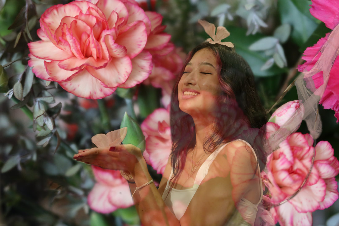
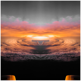
I think that the left photo should win best of class because the model looks beautiful, and it is well shot overall. The lighting coming from the front towards the model makes her look great. The positioning of her to look like she's within the flowers is extremely successful and it is a great photo overall. The photo on the right should earn honorable mention because the artistic vision of the photographer is very apparent here with the split clouds and great color grading. Overall an amazing photo of the clouds and should win something.
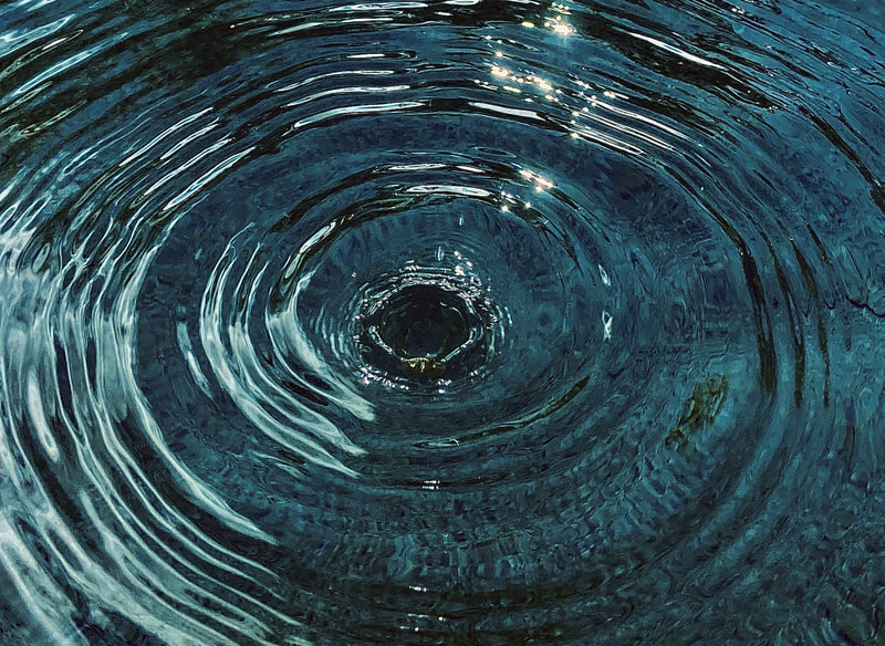
I think that this should win because there is very good lighting and composition. There is a good concept for the photo and the water looks amazing with the reflection of light ands movement because of the model. The work on the right should win at least honorable mention because of the pop of color within the blanket and highlights within the dos fur really make everything pop and contrast with each other. Everything looks amazing they should win something.
I think that Ashley's photo should win the category because it very much demonstrates the ideas of documentary photography. The editing in the photo makes everything pop and look very good. The lighting it great and the composition could be a little bit more straight but otherwise it's an amazing photo. Gabriella's photo is very good and effective in the aspect that it accomplishes the goal but I think it should've been a little bit more edited to make everything pop because it looks a little dull but otherwise it is an amazing photo and should win Honorable Mention.
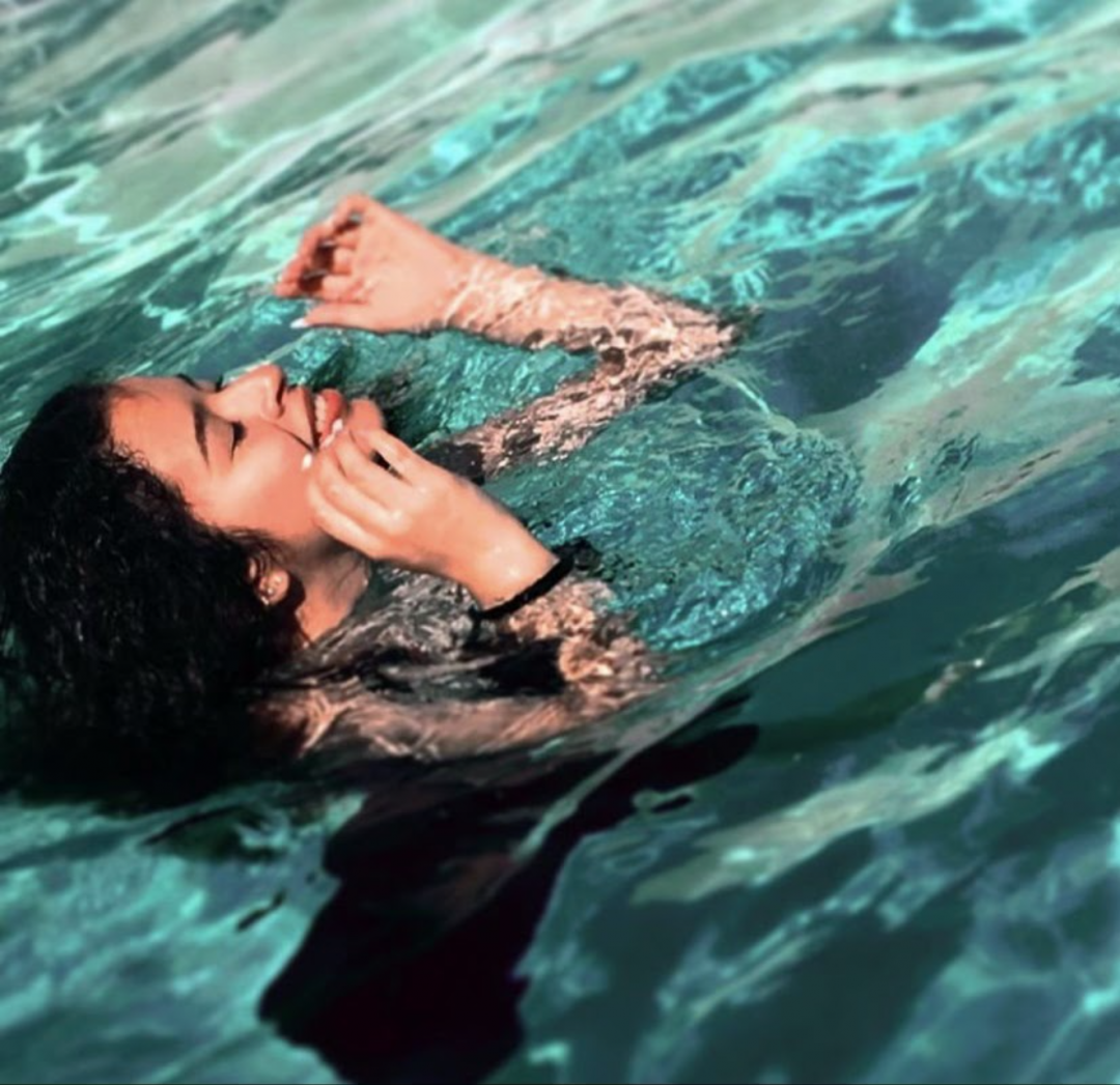
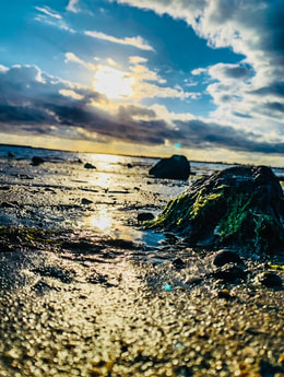
I think that the left picture should win best of class because it seems to be the most fine art of the bunch. The lines and movement add to the fine art elements, the blueness of the water is very pretty and should win the category. The right photo should earn Honorable mention because it is quite fine art and a good concept but I still think that the water photo is more fine art than anything else there.
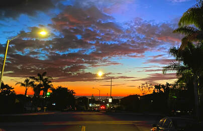
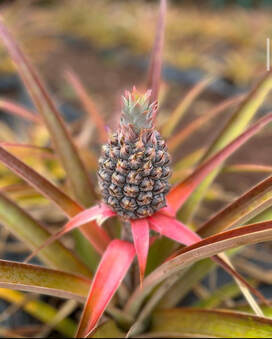
I believe that the pineapple picture should win best of class because it fully encompasses the theme of nature and it very well put together and composed. The lighting of the photo is very mild but it still keeps the heart of the photo. The ocean photo I believe should earn either 2nd place or honorable mention because it is also very beautifully composed, lit, and edited. Although I do think that it is a little bit over-edited and not so much "natural" but the picture itself is amazing and should win something.
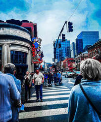
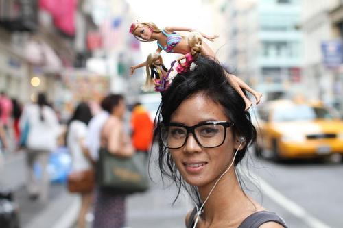
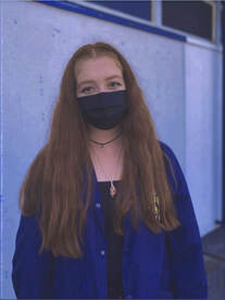
This photo by Brandon Stanton was very well done as well as mine. The color grading for my photo is not as good as Brandon's but still well done. Brandon used the rule of thirds very well by having her on one side and not perfectly in the middle. My rule of thirds was well done because she is perfectly in the middle. I think that if my model would have taken her mask off it could've been better but I think it is still well done. The background of Brandon's photo is better because it incases the people of New York and mine was supposed to encompass people at Bonita so I should've done it in a more populated area.
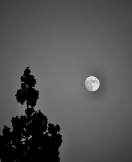
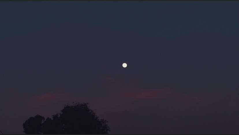
Both pictures are very good although I think Sophia's is much better because the moon is much closer in the photo and mine is just a small dot in the center. Also Sophia's is a lot higher quality, which adds depth to the photo. There's lots of visual texture in Morgan's photo as well as a good use of light and shadows. Her photo is so well done and it does not compare.
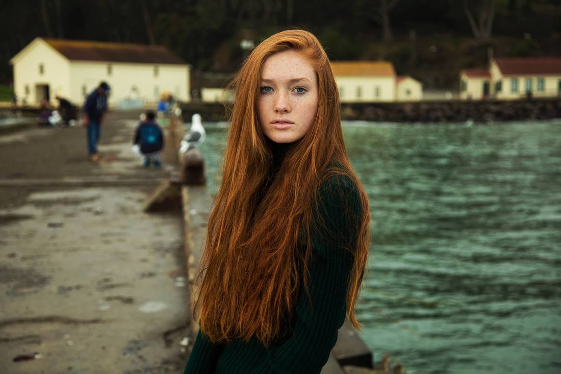
Mihaela's photo is amazingly done for the purpose it is trying to serve. Atlas of beauty is an amazing project and this woman is extremely beautiful and the way she was photographed really plays into that. The lighting is perfect and the composition of her body and the setting around her really helps with the theme. My photo is extremely casual and supposed to show off humans at BVHS which I think it achieves but Mihaela's photo is just so much better quality.
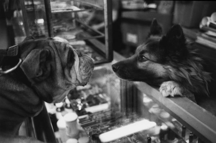
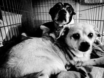
Both of these photos are very good but I think that Freedman's photo is much better because of the mere quality and likeability of the photo itself. The dogs in freedman's video seem much happier and lively than in my photo. The lighting in this photo is very soft and fits the mood of the photo. The composition of Freedman's photo is very fitting to the mood and seems very cute. I think that the black and white fits well but I would also like to see a color version.
|